PowerHub’s latest version introduces a refined style guide aimed at enhancing clarity and usability across the application. Key improvements include a cleaner UI with a simplified colour palette, featuring bright accent colours and soft border hues that add subtle definition without overwhelming the interface. Overlays and modals now incorporate soft shadows, giving elements a gentle depth while maintaining focus. The modern Open Sans typography brings a contemporary, readable look, complemented by balanced spacing and accent colours that help users quickly identify key information. This cohesive, refreshed design aligns with PowerHub’s commitment to a user-friendly and visually appealing experience.
Colour
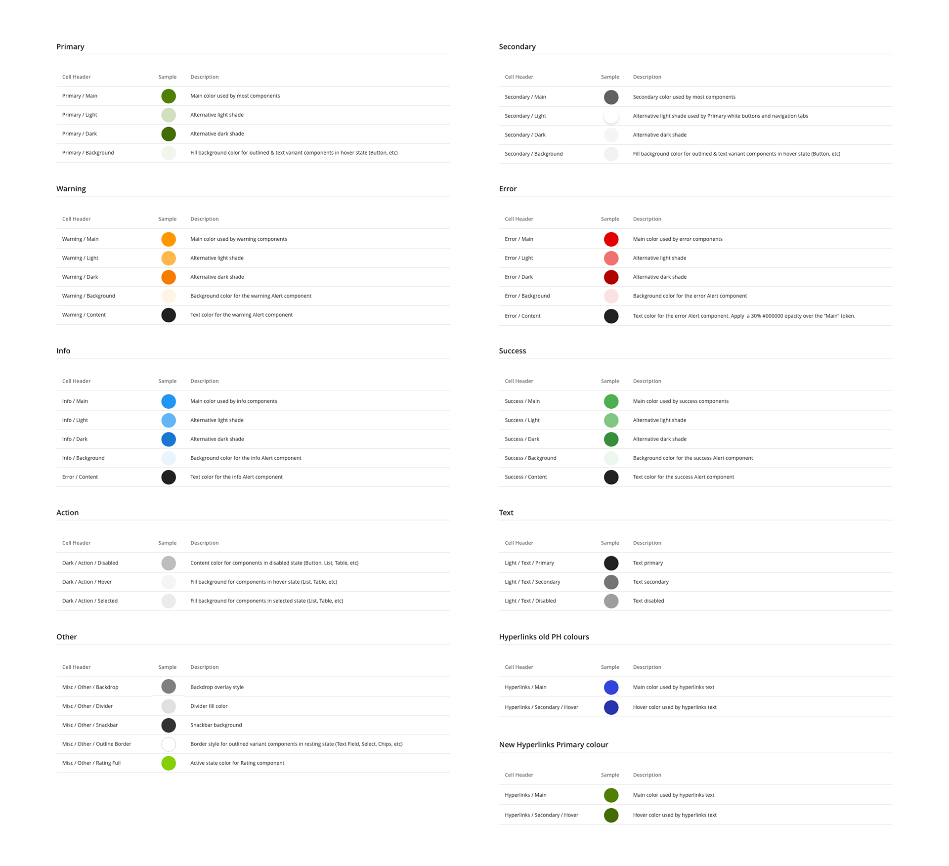
The PowerHub colour palette is thoughtfully structured to maintain a clean, white-centric UI with purposeful splashes of colour that enhance usability and draw attention to critical areas like tasks, invoicing, compliance, ticketing, and status indicators.
Surface Colours
Primary background is #FFFFFF ensuring a bright, uncluttered interface.
Container Colours
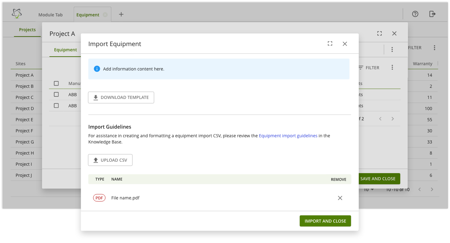
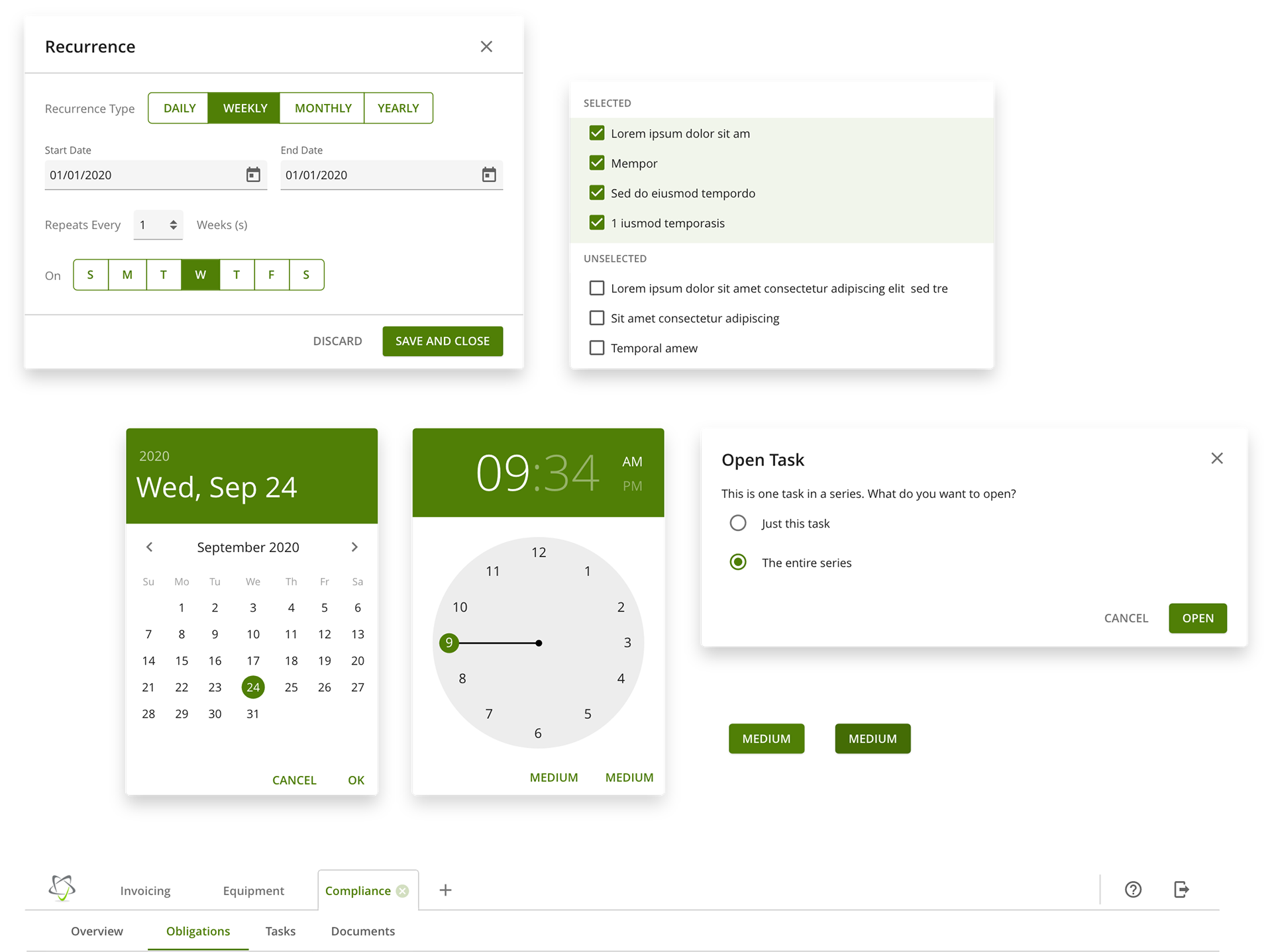
Applied to components that sit on top of the background, such as modals, dialogs, cards, and banners.
On-Surface Colours
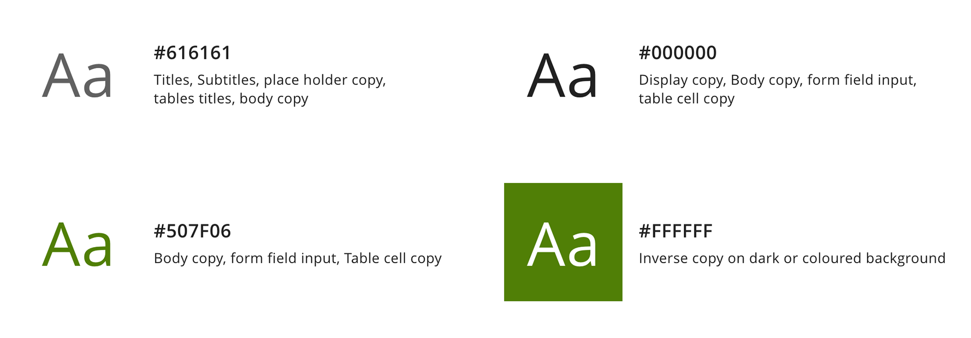
Typography and icons are highlighted with a refined color scheme: headers and sub-headers use #616161, body text is #000000 for clarity, and icons are #616161 or accent green #507F06 to add vibrancy to interactive elements. This approach ensures a cohesive, accessible design.
Border Colours
Border colours are applied to strokes, divider lines, and around containers offering gentle visual separation without distraction.
Alert Colours
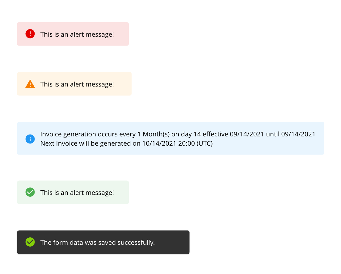
Alert colours provide immediate visual cues to guide users.
Red Highlights errors that need addressing before continuing.
Yellow Warns of potential issues, prompting caution.
Blue Conveys non-critical information, maintaining a neutral tone.
The Green success indicator has been updated to a Snack Bar notification, designed to provide users with unobtrusive feedback on completed processes or actions. Snack Bars appear temporarily at the bottom of the screen, offering a quick confirmation without interrupting the user experience. They fade out automatically, requiring no action from the user to dismiss them, ensuring a seamless and fluid interaction flow.
Accent Colour
The primary accent color, #507F06, is used to highlight actionable elements like buttons and links.
Usage
This accent appears as text, icons, and container fills, as well as in brand buttons, hover, and active states. Border accents enhance button outlines, while background accents highlight menu components, ensuring interactive elements are distinct and engaging.
Typography
PowerHub uses the Open Sans font, a modern, clean, and highly readable typeface ideal for presenting extensive content. Designed for legibility across digital interfaces, Open Sans maintains clarity in long forms, dense data tables, and content-heavy sections, ensuring that information remains accessible and easy to read. Its balanced proportions and open letterforms make it an excellent choice for both headers and body text, supporting a user-friendly experience in applications with detailed, data-rich content.
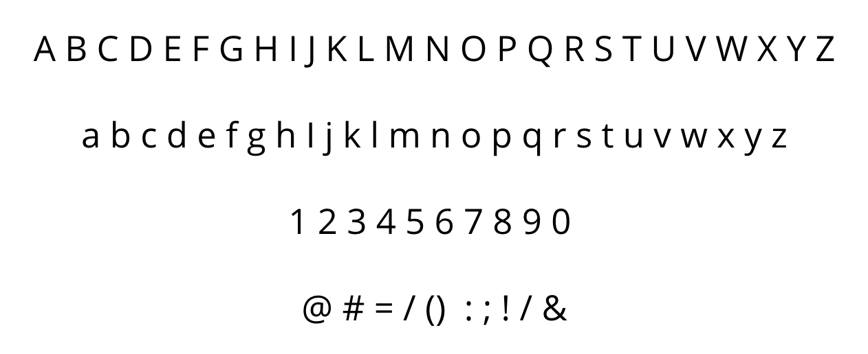
Open Sans Typeface
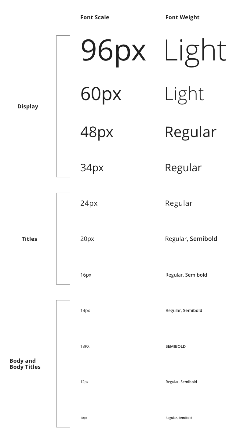
Font Scale
The PowerHub font scale ranges from 10px to 24px for standard application content, with larger font sizes up to 48px reserved for display text.
Font Weight
PowerHub UI utilizes light, regular and semibold font weights exclusively.
Light is used for large display text (48px and above).
Regular is used to titles (18px–24px) and all body text (14px).
Semibold is reserved for form subtitles (16px), buttons, and smaller titles (10px–13px).
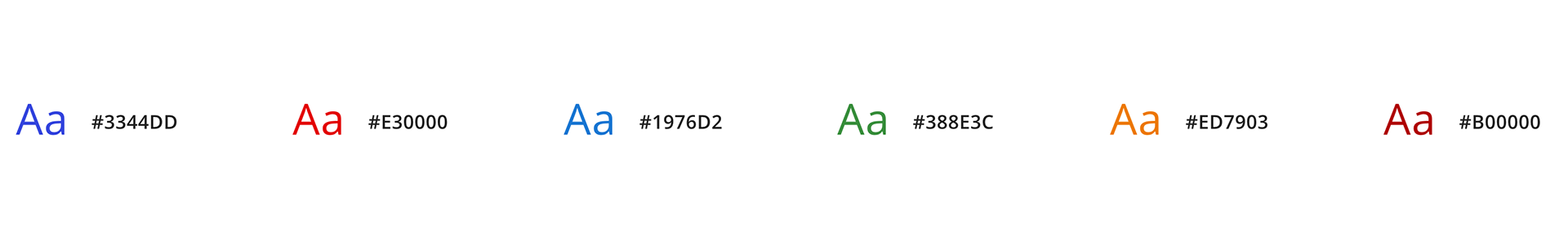
Platform Font Colours
Additional Font Colours
Colours assigned to hyperlinks, documents type, errors messages, priorities and status.
Spacing
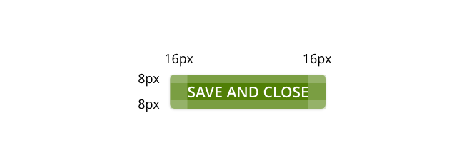
In the PowerHub application, the 8px grid serves as the foundation for structuring and aligning UI components across the interface. This grid system ensures that all elements—whether spacing, margins, or padding—align in multiples of 8px, creating a cohesive and balanced layout. By using the 8px grid, the PowerHub design maintains consistent alignment and structure across various components, such as tabs, buttons, and data tables. This grid-based approach reduces visual clutter and improves readability, helping users navigate the app seamlessly.
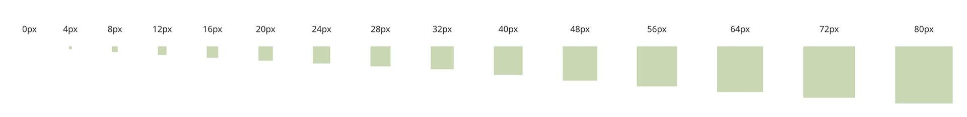
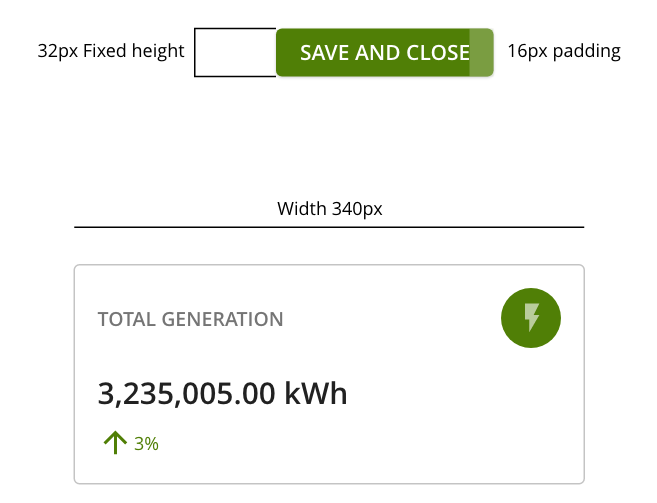
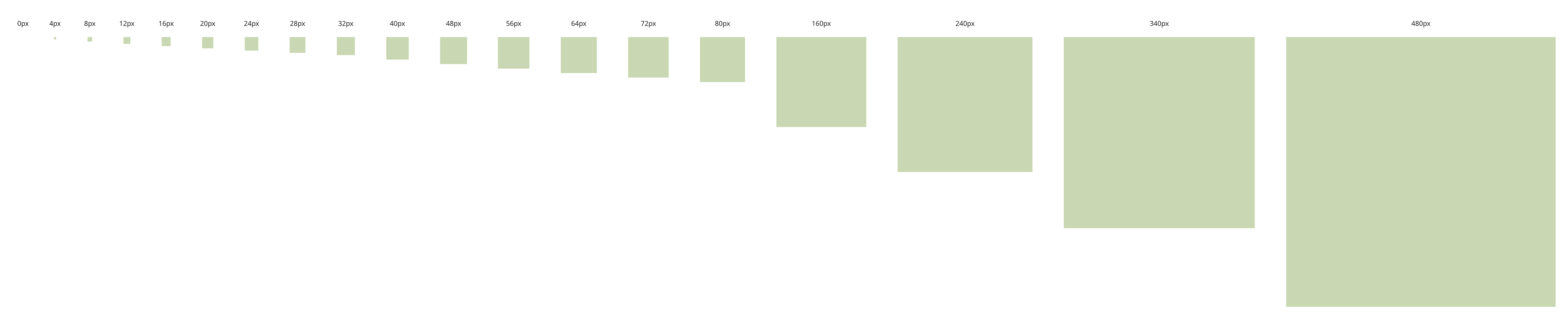
Sizing Scale
The PowerHub application’s sizing scale complements the 8px grid by setting component dimensions in increments that align with the grid. For example, small elements like icons and action buttons use sizes like 16px and 24px, while larger components like form containers and modal dialogs adhere to 40px, 64px, 128px or 340px dimensions. This consistent sizing scale not only improves visual harmony but also makes scaling for different screen sizes simpler. Whether it’s a form dropdown or a notification banner, the sizing scale ensures that every element is proportionate and aligned, creating a professional, intuitive user experience.
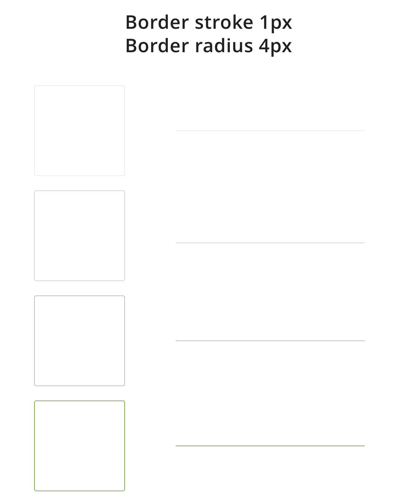
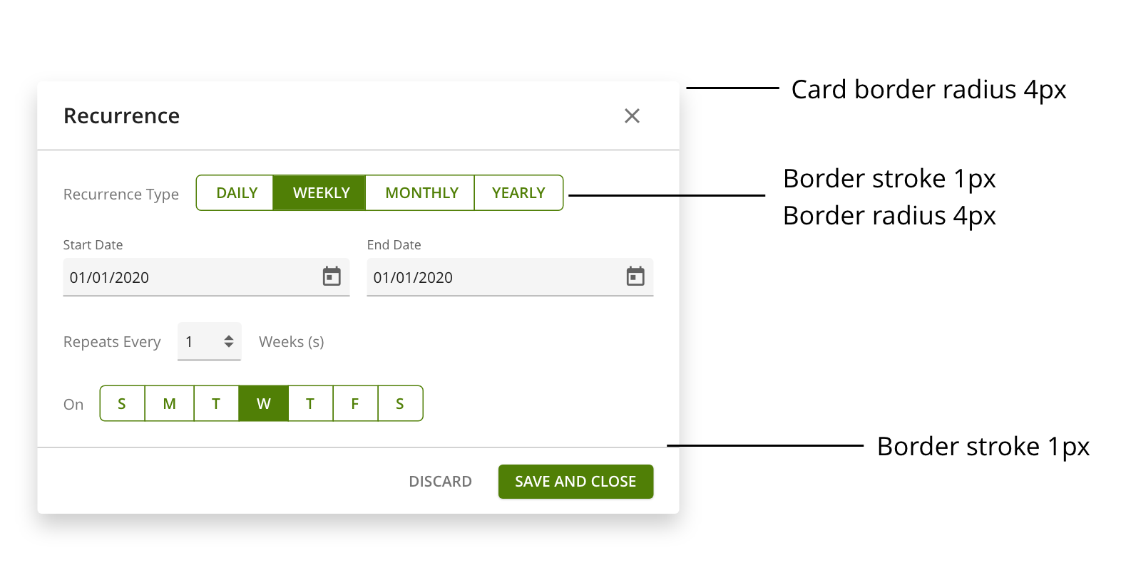
Borders and Border Radius
Border radius, which rounds the corners of containers, enhances the visual appeal and approachability of UI elements. In our application, a styling hook sets border radius to either 0px or 4px. These radius values are applied consistently across components such as modals, dialogs, menus, and cards, adding a subtle polish to the UI while distinguishing interactive areas. The 4px radius gives elements a softer, more inviting look, while 0px maintains a clean, angular style when a sharper appearance is desired.
Shadows and Elevations
Box shadows represent elevation and visually distinguish elements layered over one another. Soft shadows create depth and separation in the UI, enhancing realism and clarity.
No Shadows: Applied to the base level and select components like notification banners, graphic elements in repeaters, and comment boxes within form modals. This shadow-free approach maintains a clean design, particularly in long forms where minimalism is key.
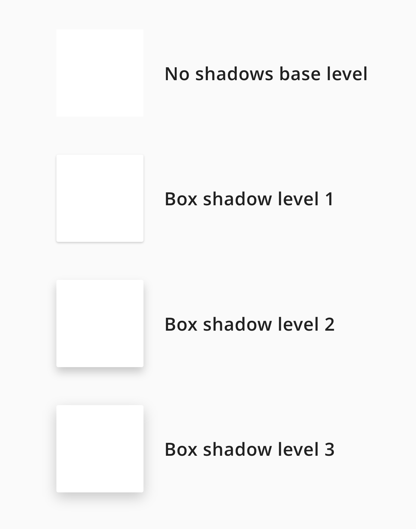
Shadow Levels
Three shadow levels are used based on component hierarchy
Level 1: Light shadow for dropdowns within forms, providing just enough contrast to separate dropdown content from the form itself.
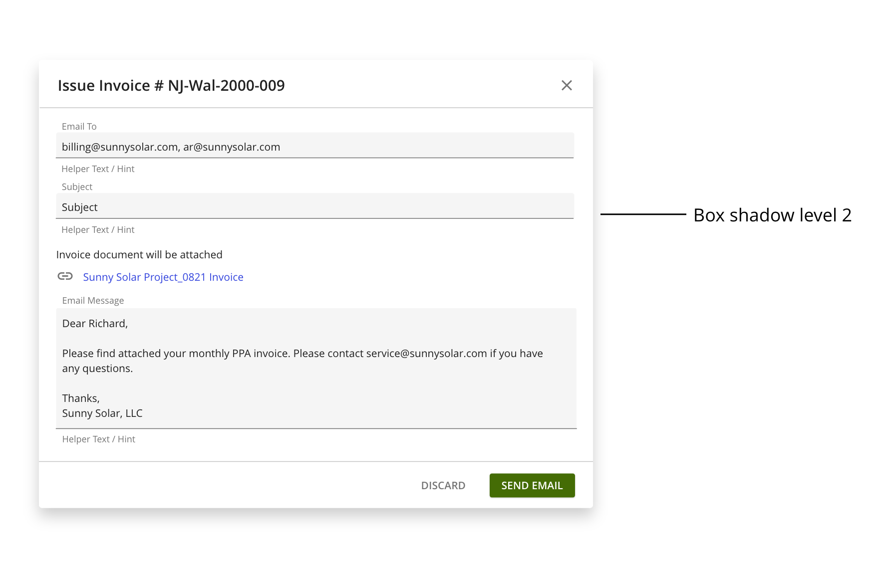
Level 2: Medium shadow used on cards, menus, dialogs, and modals, placed over the base level or an overlay for a slightly more prominent effect.
Level 3: Heavier shadow reserved for larger modals and high-priority components like login or sign-in cards, adding prominence and focus.
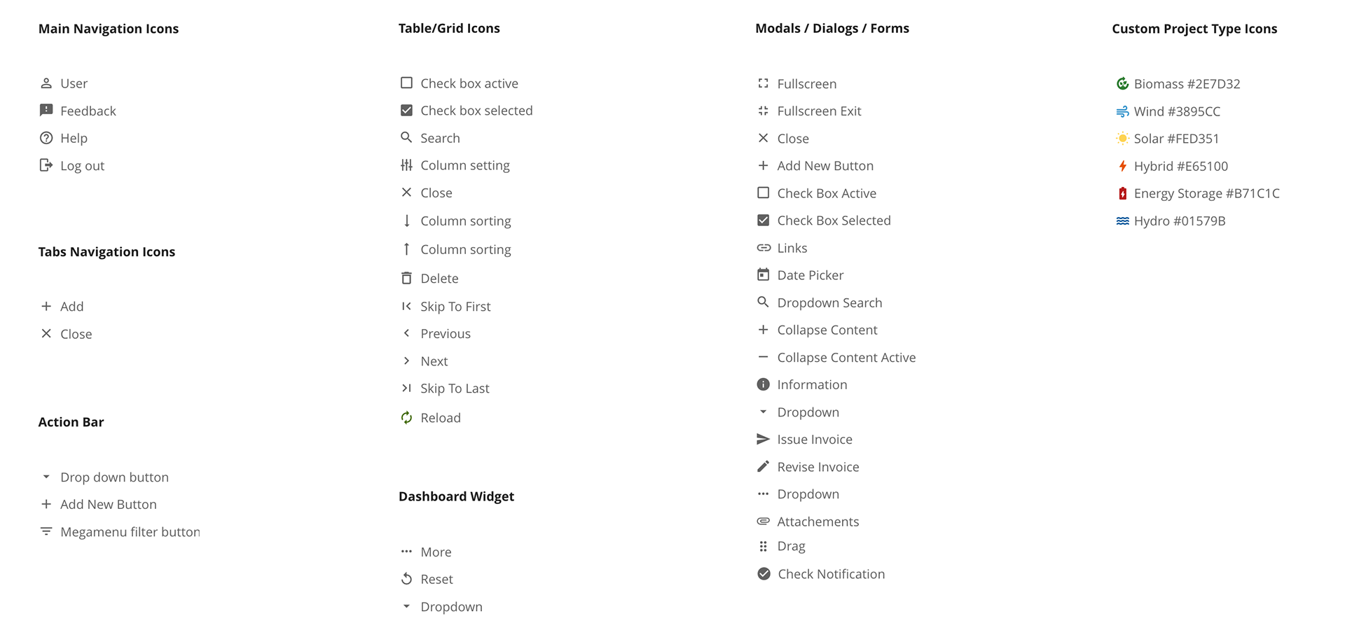
Icons
In PowerHub, icons and illustrations are crafted to maintain a modern, approachable, and user-friendly visual language. Using Material Design principles, the system icons are simplified to their essential forms, making them clear and easily recognizable. These icons are carefully selected and styled to match the application's overall aesthetic, which includes a clean, streamlined interface with minimal distractions.
Illustrations
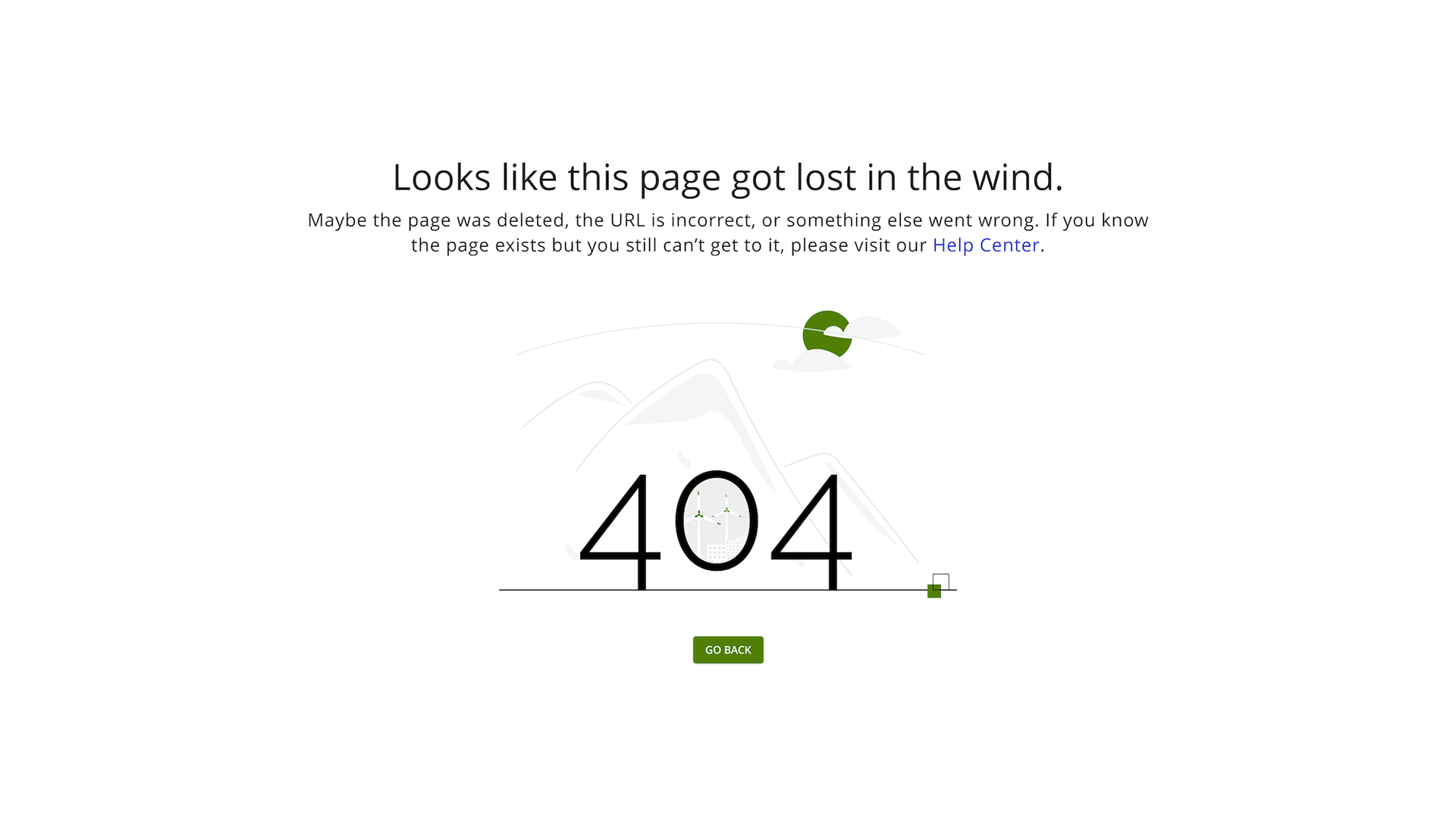
For instance, in the 404 error page design, you can see how the illustrative icon of the mountain subtly suggests being "lost," while maintaining a lighthearted, approachable tone. The use of minimal colours and straightforward shapes ensures that the icons are both visually appealing and functionally effective, reinforcing the application's goal of clear communication. The combination of iconography with friendly messaging and whitespace creates a calm, uncluttered experience for users, even in error states.