Overview
Create a "404 Page Not Found" for the PowerHub platform to enhance user experience. The goal was to design a clear error page that prominently communicates the issue while offering intuitive navigation options for users to return to the previous screen or seek help. This design addresses potential frustrations users may face when customizing their platform modules, ensuring a smoother and more supportive experience.
The Challenge
Users encountered significant difficulties when they make changes on the PowerHub platform and are unexpectedly taken to a "404 Error Page." A major source of frustration was the absence of clear guidance on how to return to their previous state, compounded by a lack of helpful options like links to relevant sections of the platform or access to customer support.
Process
Research
Ideation
UI UX Design
Dev Handoff
Ideation
UI UX Design
Dev Handoff
The Solution
To enhance the user experience on the "404 Error Page," we implemented a user-friendly design featuring a clear error message and intuitive navigation options. Prominent buttons and links guide users back to their previous page or to relevant sections of the platform. Additionally, we incorporated a help or support link to provide users with immediate access to assistance, ensuring they can quickly resolve any issues and resume their tasks without frustration.
My Role
As a UX/UI Designer, I collaborated closely with the project lead and developers.
Adobe XD
Adobe Illustrator
Adobe Illustrator
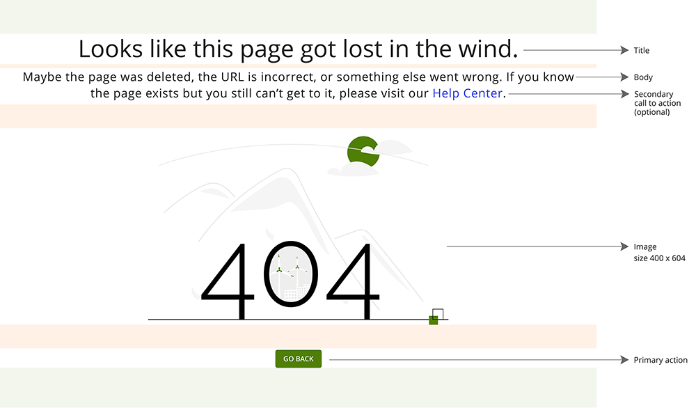
404 page Specs and Style Guide
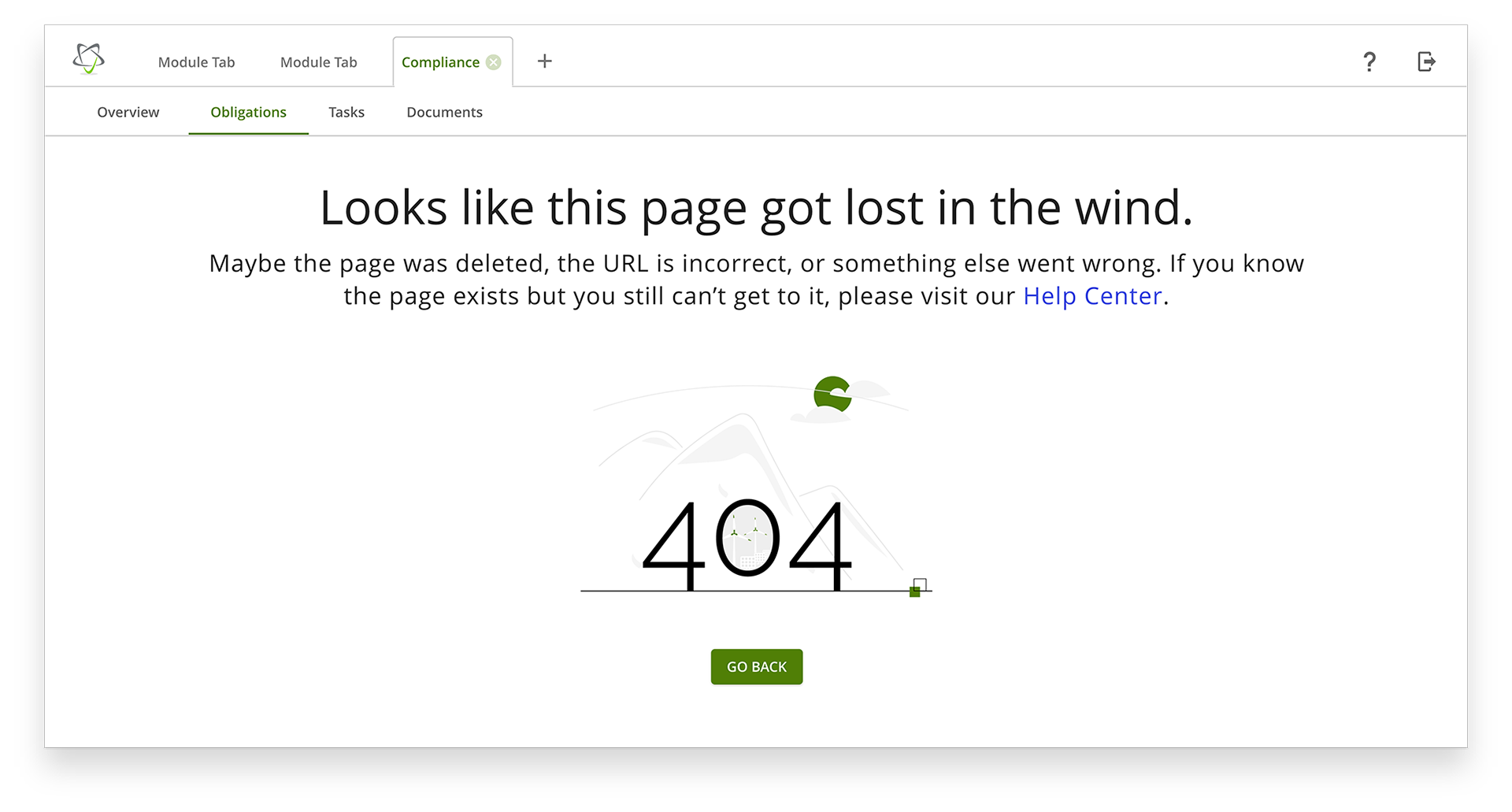
The header is consistent with PowerHub’s branding, and the large "404" error message immediately catches the user's attention. Beneath it, a brief subtext explains the error in simple terms. Navigation options, such as a prominent "GO BACK" button and links to the homepage and Help Center, are easy to locate.
The background includes relevant imagery like mountains and windmills, enhancing visual appeal. The buttons are styled to stand out. All text, button, and image sizes are clearly annotated for consistency.
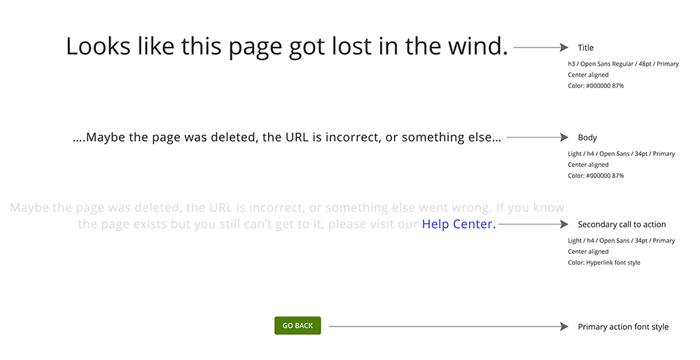
Typography is bold for the error message, with regular, readable fonts for the text and navigation options. High contrast between text and background ensures readability, and buttons are styled to stand out.
High Fidelity Screens
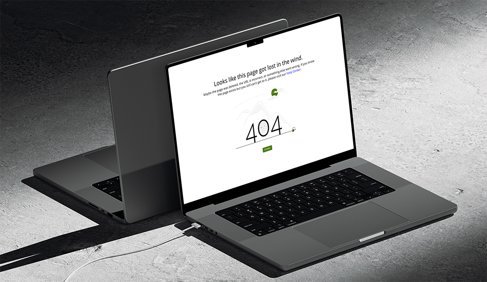
In my new design, I went for a cleaner, minimalist look. The design is accessible, using legible fonts and intuitive navigation, and is responsive across all devices, ensuring usability on tablet, and desktop.